BOWMAN III RESIDENCE
A Whole Home is Upgraded to Create a Lighter, More Open Sensibility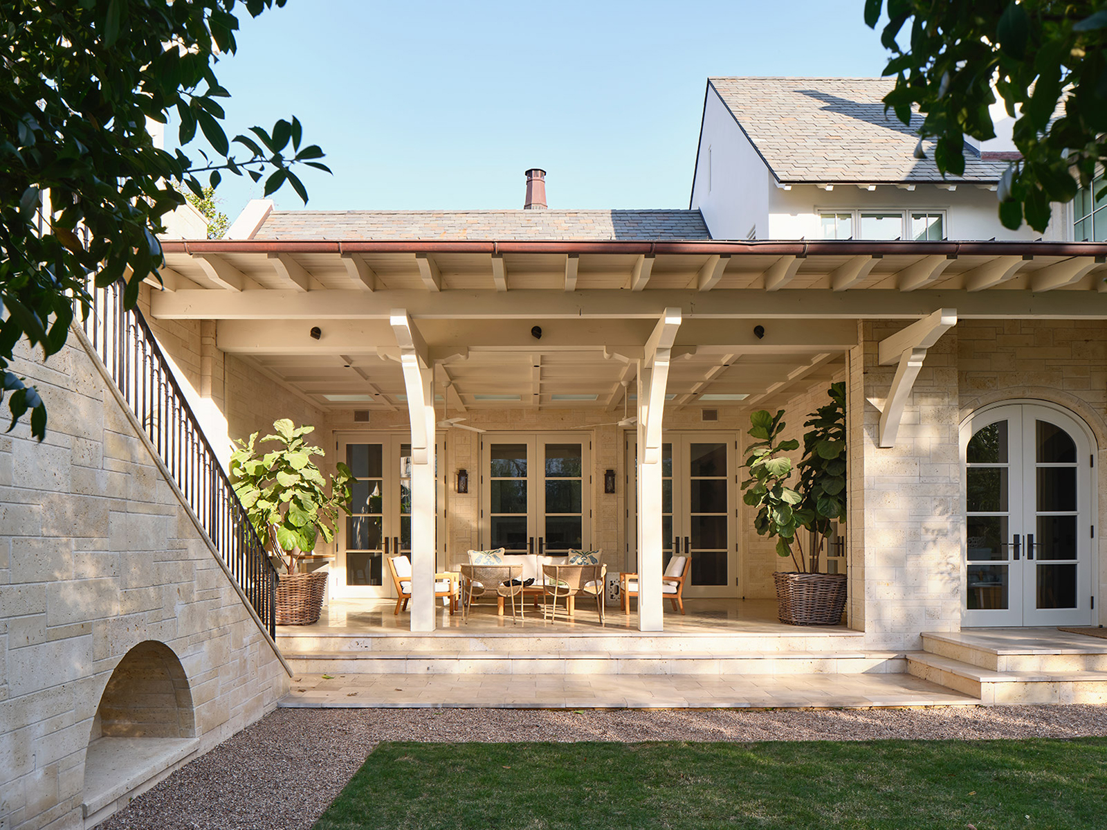
ARCHITECT
Faye + Walker Architects, Sean Guess
THE GOAL
Renovate a house built in 2006 to bring it in line with the owners’ stylistic tastes and desire for a more open feel.
THE PROCESS
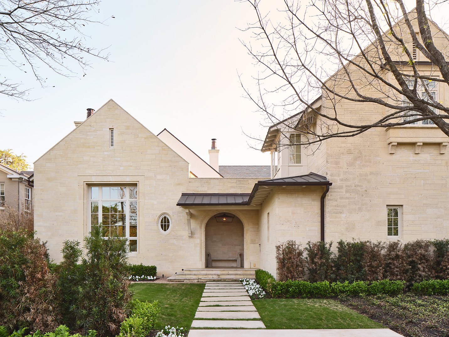
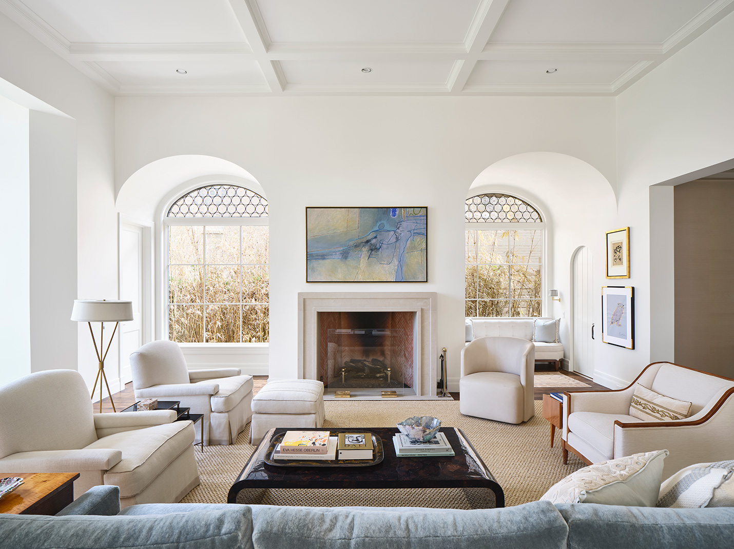
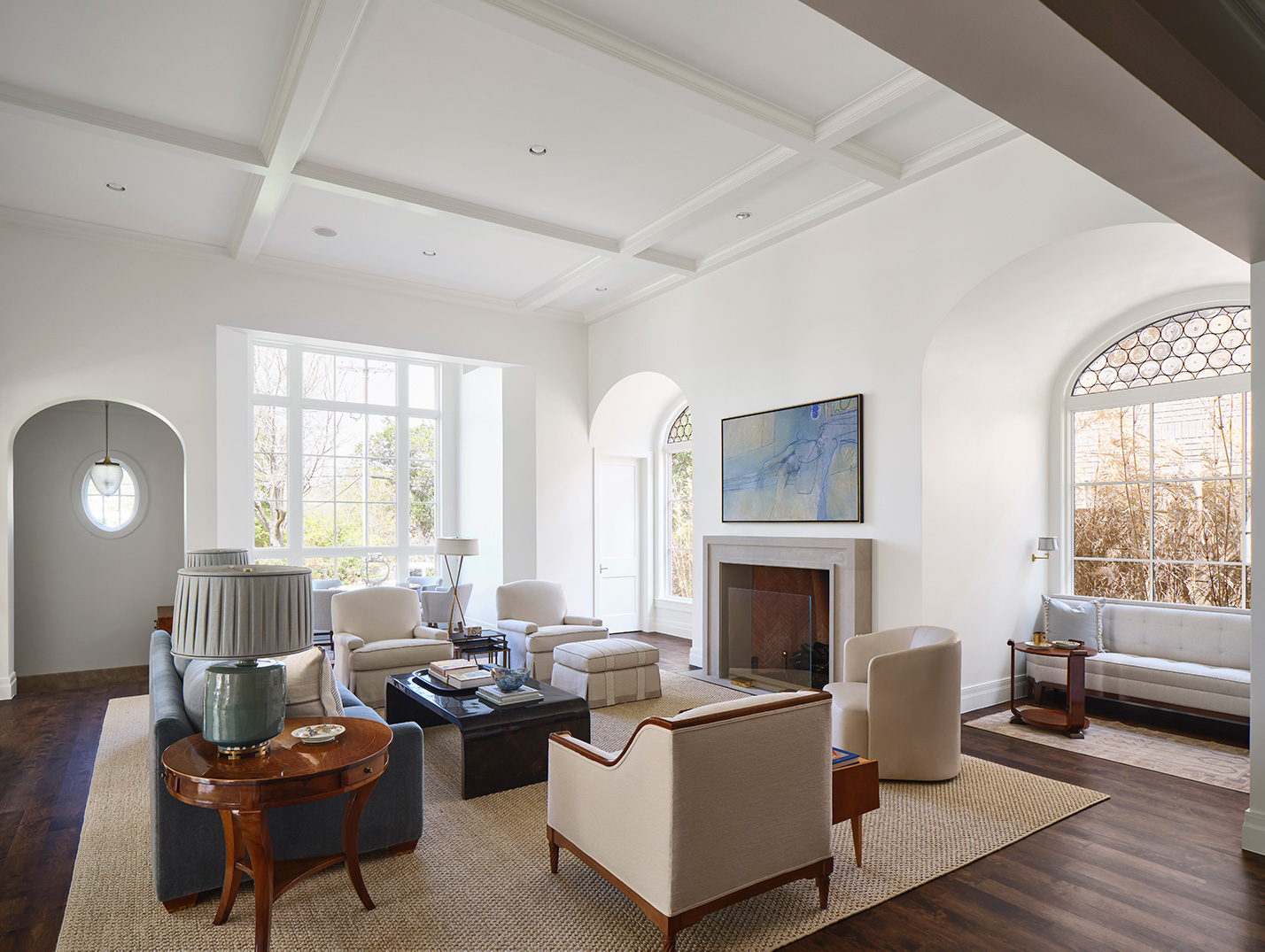
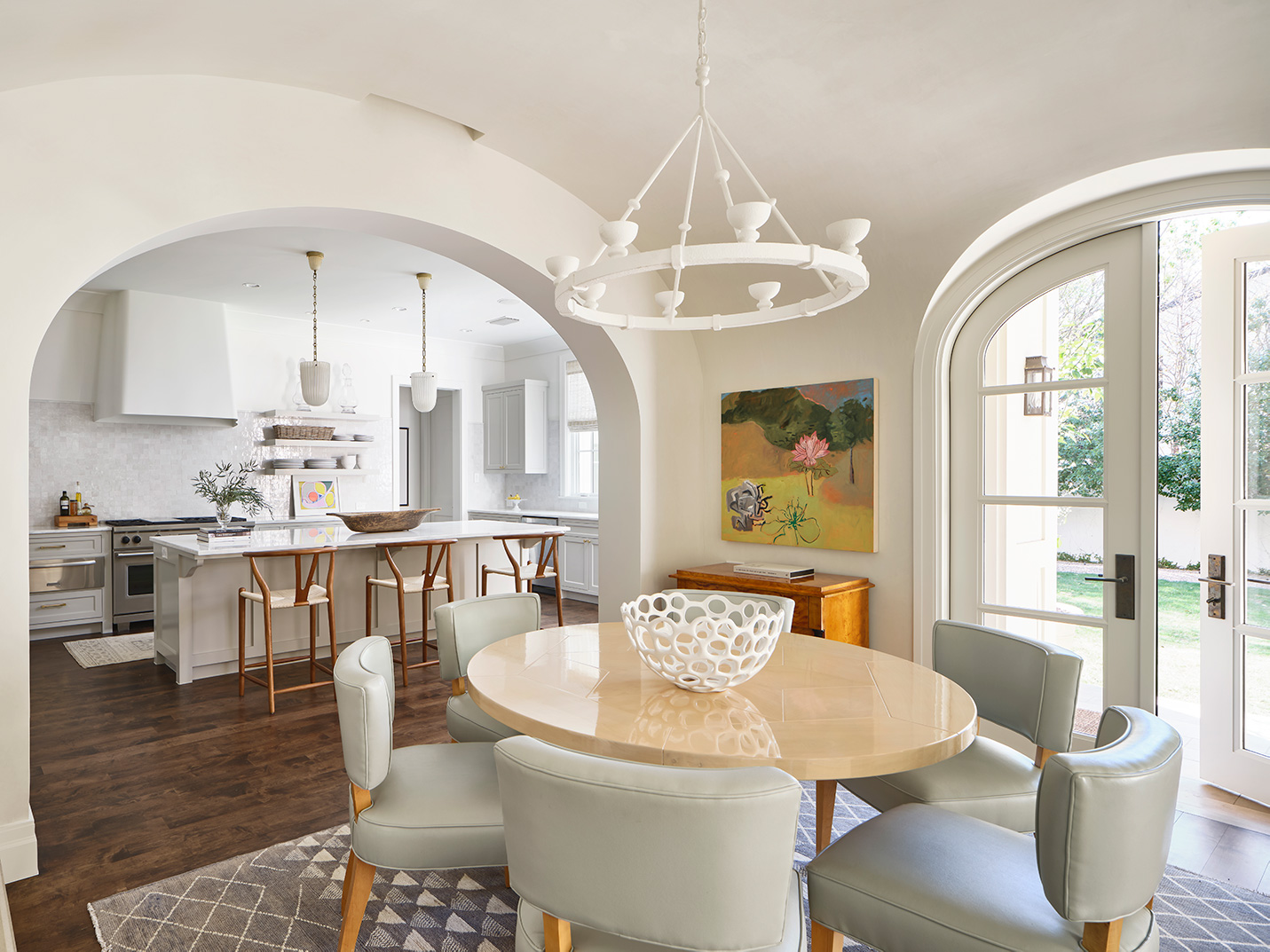
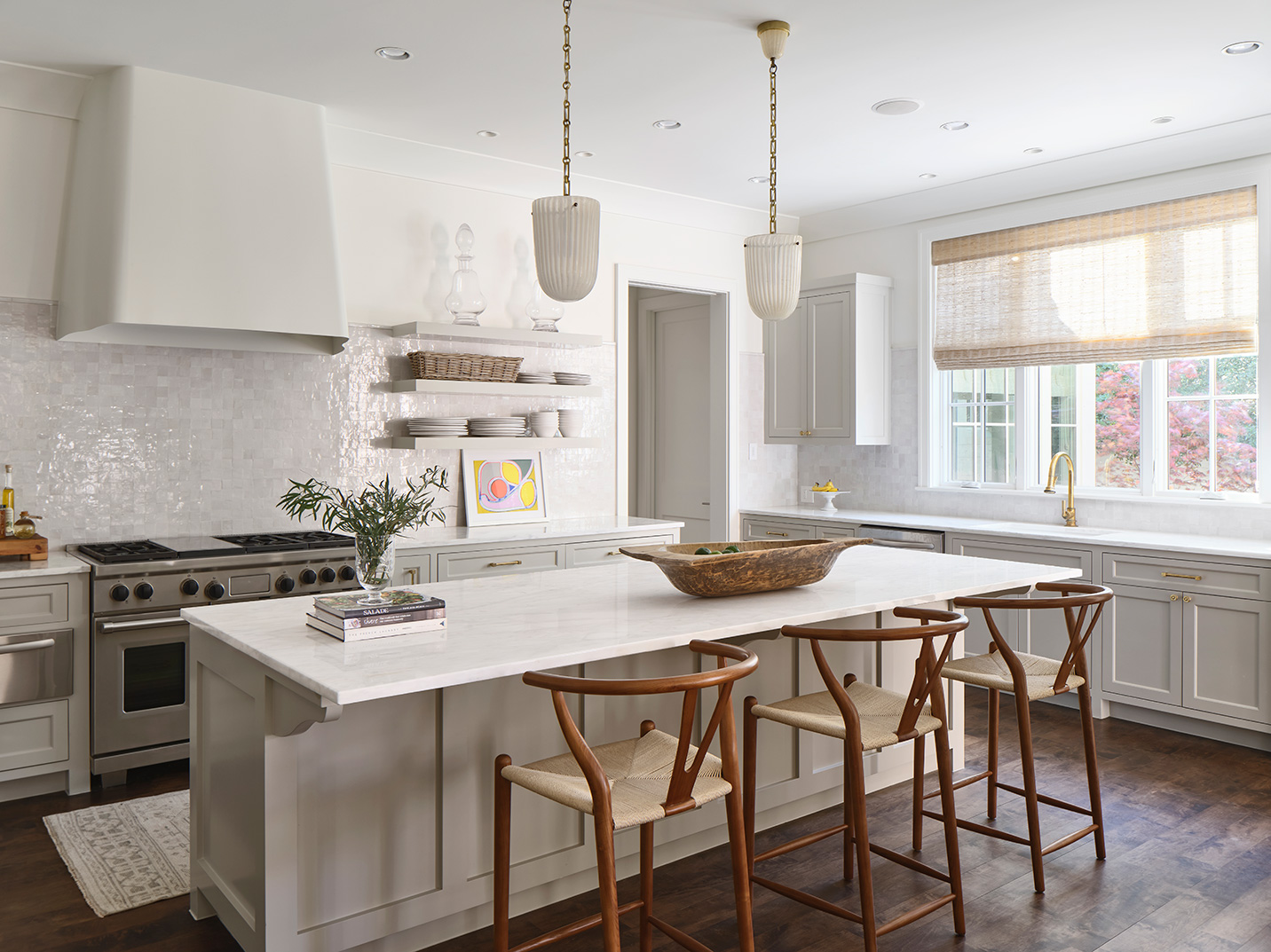
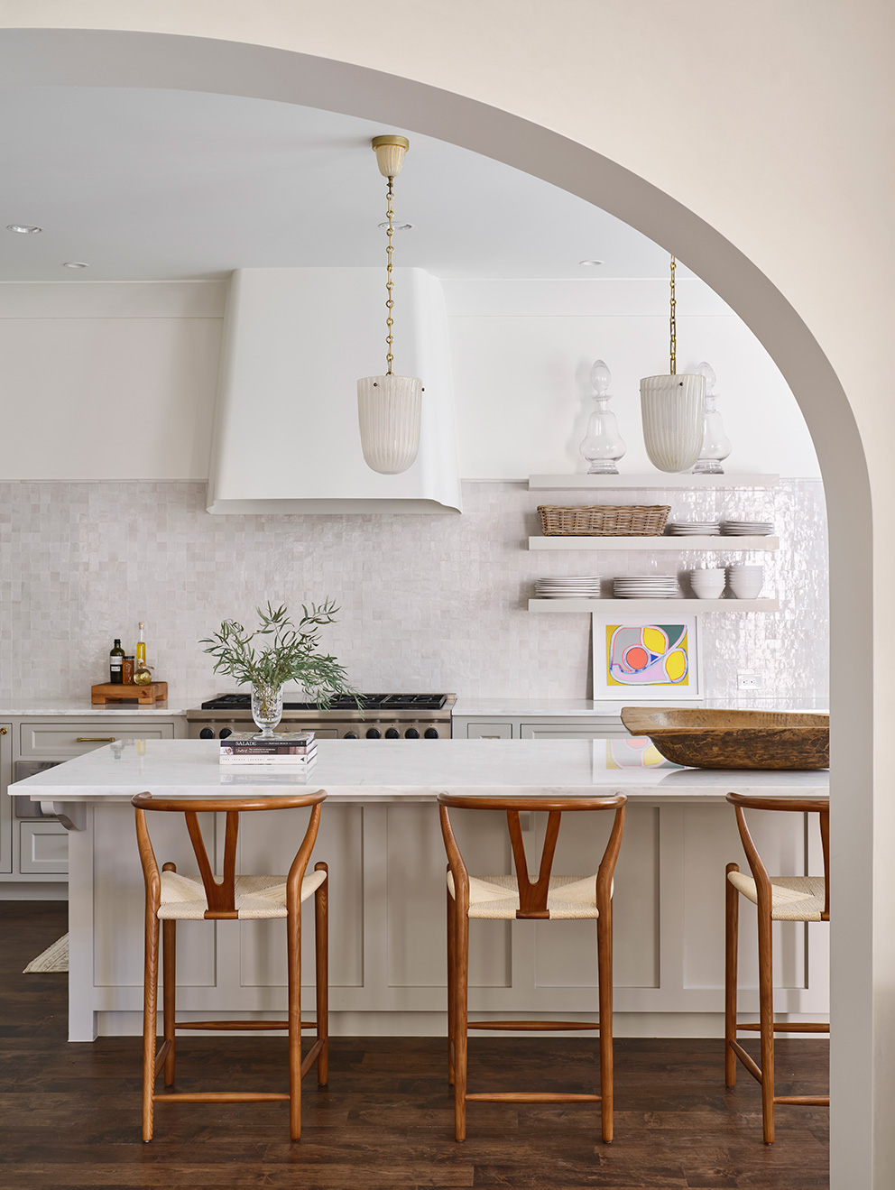
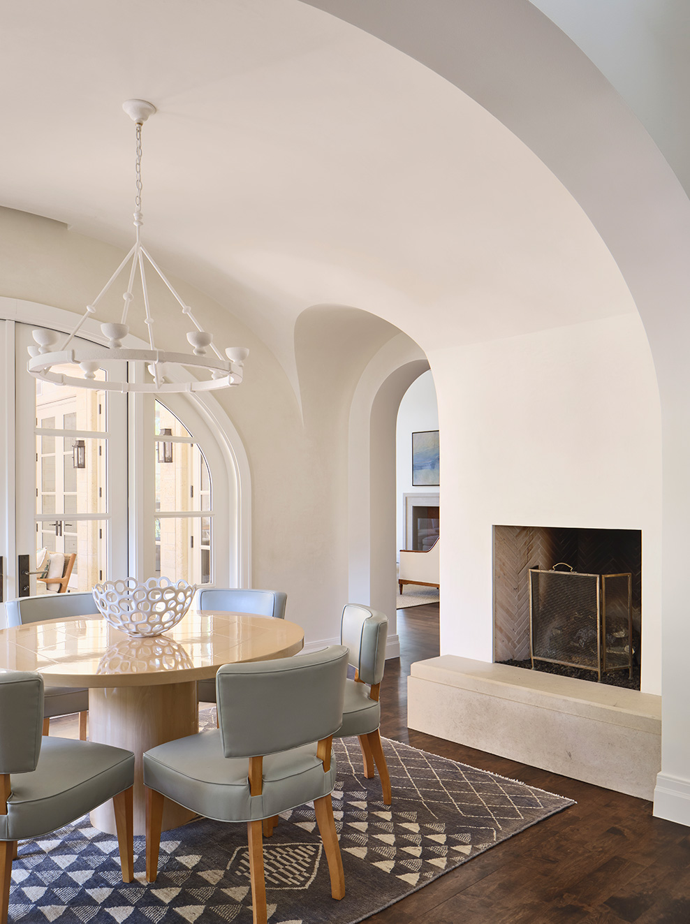
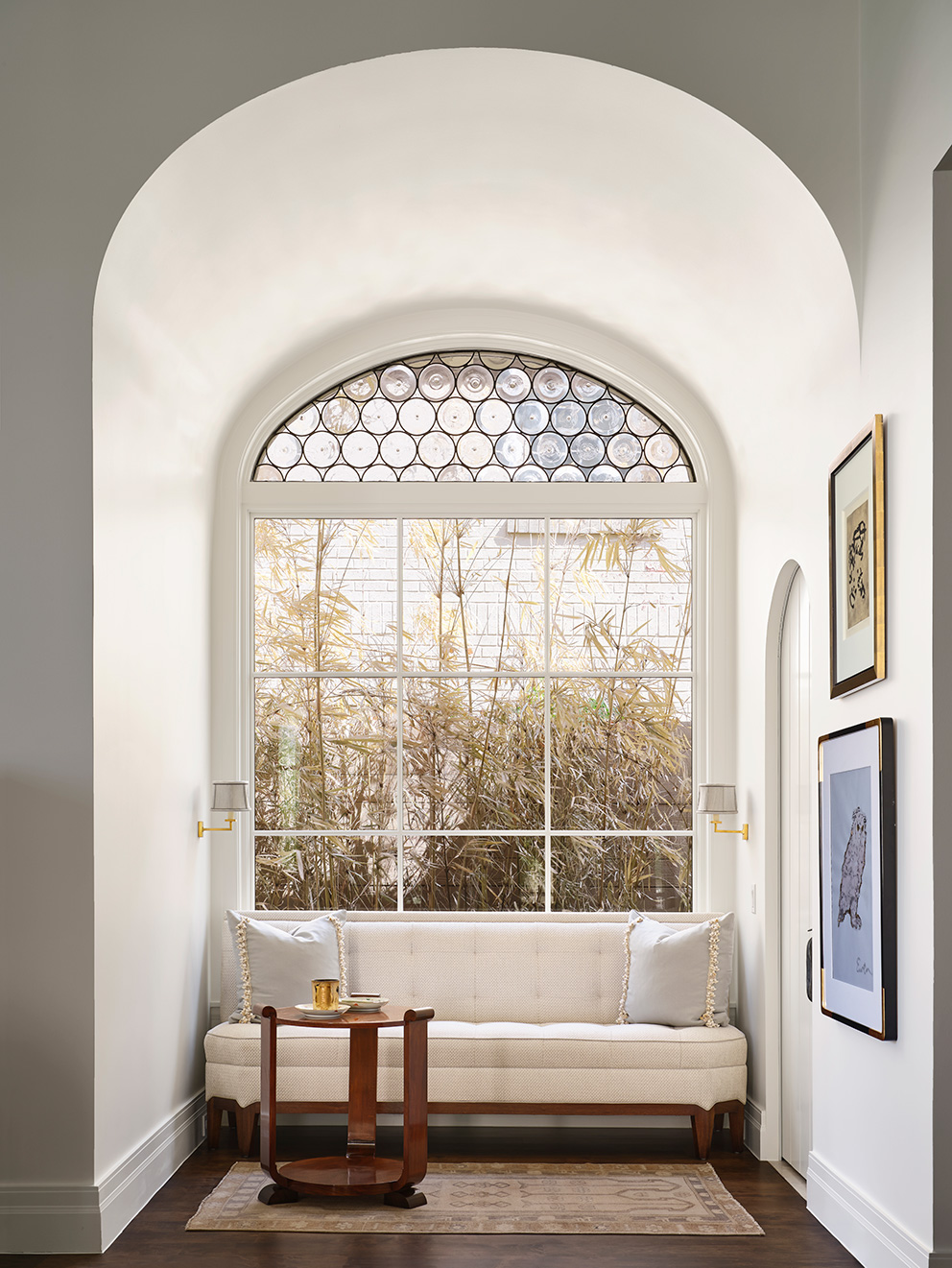
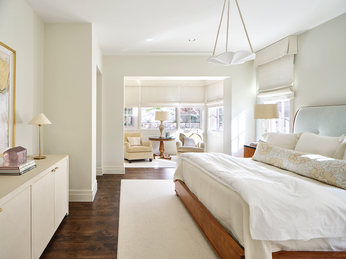
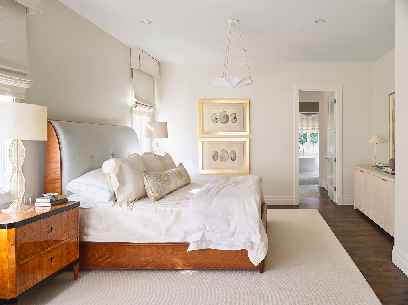
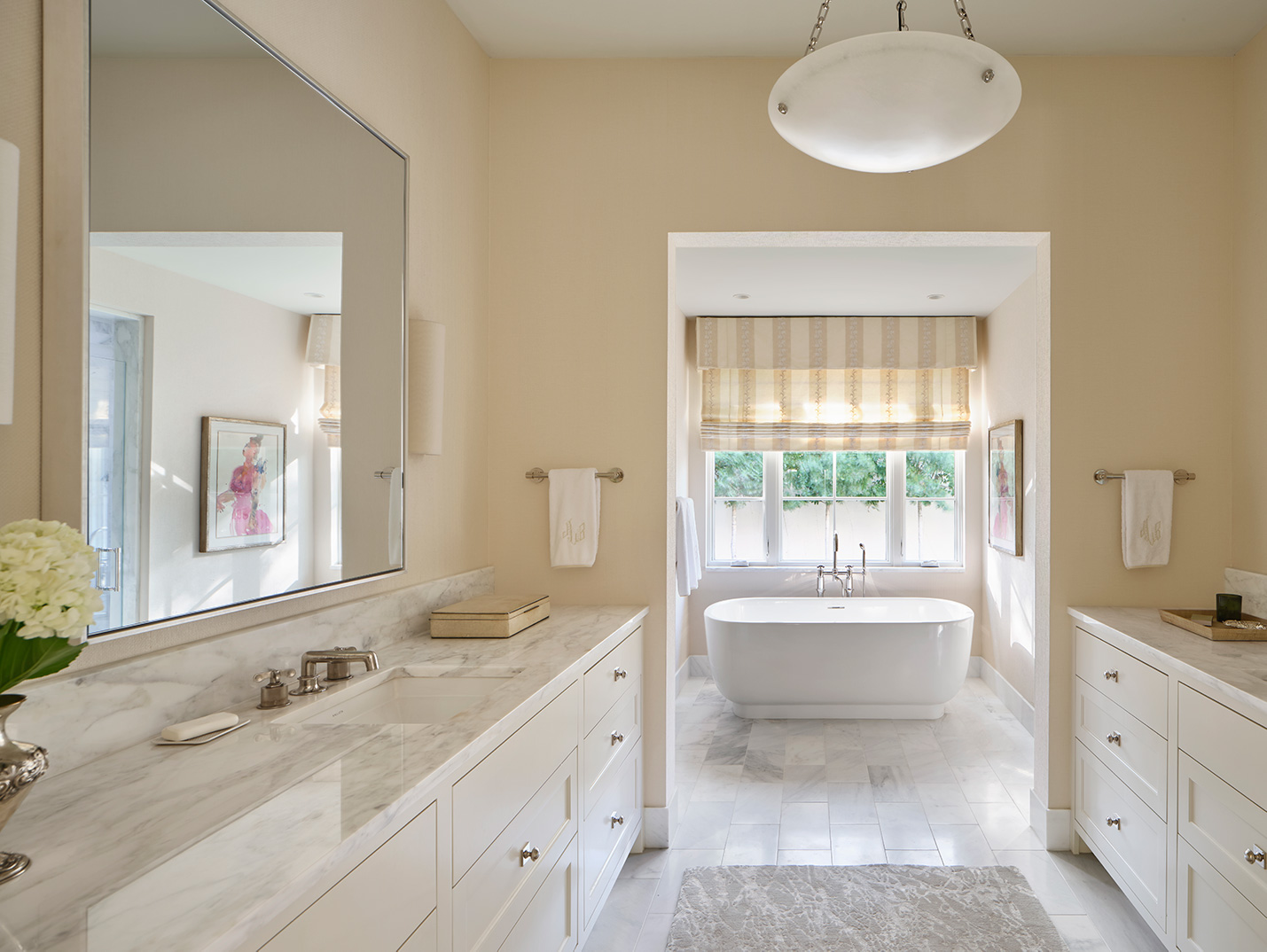
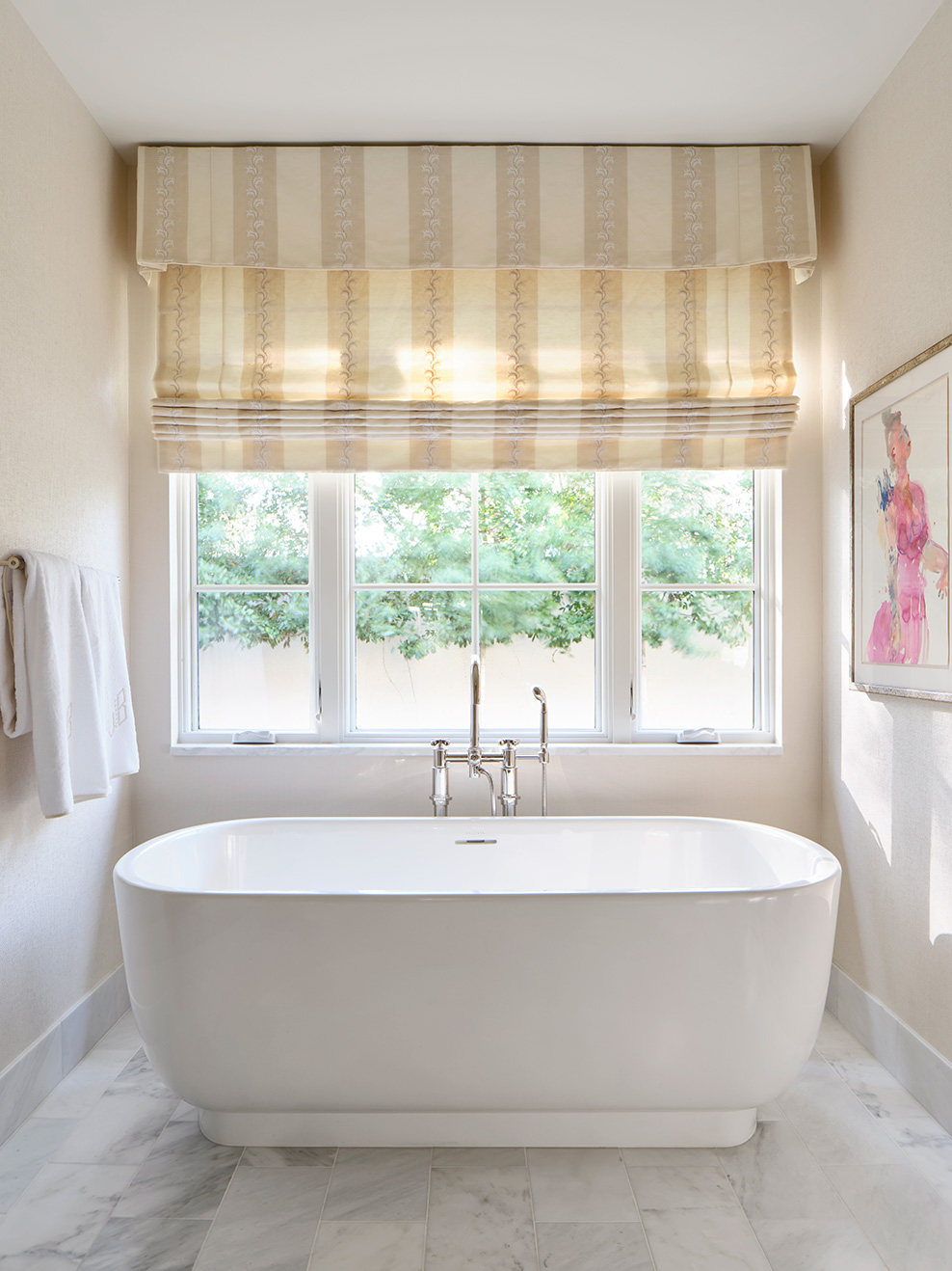
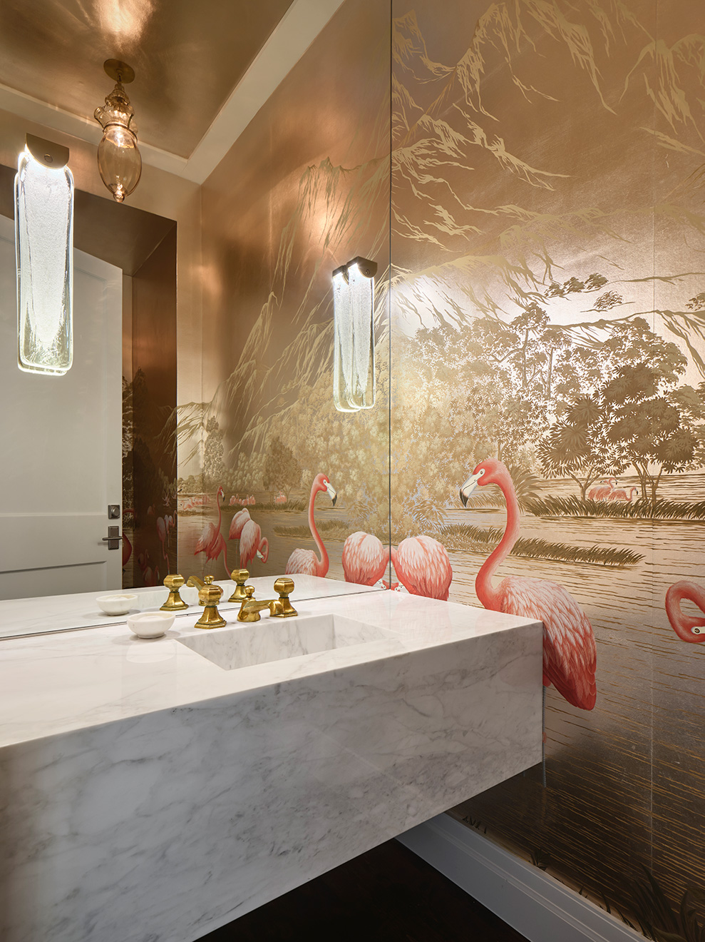
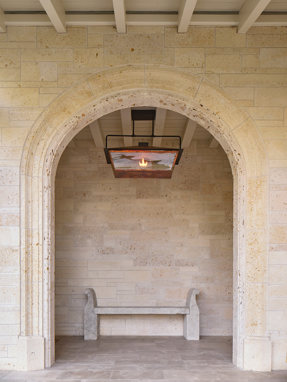
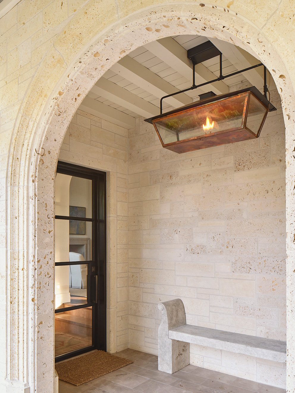
Although their home was well built, the homeowners preferred a more contemporary architectural style. We made changes throughout the interior and exterior of the home to open up the space and invite in more light. Previously, the dining and living areas had been separated by a wall, creating a dark dining space. In order to achieve the client’s desired open feel, we removed the wall. High-gloss paint on the ceiling in the dining room now contrasts with a fine wallpaper to create an elegant backdrop to the dining area. In the living room, beyond repainting the ceiling with a high-gloss paint and the walls in a crisp white, we added a window beside the fireplace where there had previously been a wet bar, significantly increasing the natural light. The existing fireplace mantel was then reduced in scale to make it less a feature and more a supporting piece to the elegant living room. In the kitchen, we repurposed existing cabinets where possible and added new ones. The new countertops, tile, and paint palette yield a cleaner, more functional kitchen. To continue the project of brightening up the home, we reskimmed the breakfast area plaster to a lighter color. In the master suite, an arched passage to a reading area was reframed into a rectangular shape. Additionally, the master bath was completely renovated; marble countertops and tile create a refined space with lighter and brighter finishes. The lighting in all common areas was also upgraded and organized to complement the client’s new furniture layout. Throughout the residence, we refinished existing hardwood floors in a darker stain to anchor the now bright and airy rooms. Existing mechanical systems were replaced, and ducts and vents were relocated to less visible locations. On the exterior, we repainted dark woods with light colors to create cohesion with the design upgrades throughout the home. By reworking existing stonework, we modified the entry to eliminate access to a courtyard that adjoins the formal living area, thus ushering guests directly into that area. Finally, the outdoor living space received upgrades such as reworked stone paths, lighter ceilings, and new lighting.
THE FINAL RESULT
In a brighter and more spacious house upgraded to enhance their daily lives, the new owners now feel more at home than ever on a street they love.


